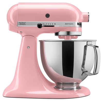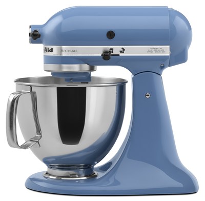
BENTON HARBOR, Mich., Dec. 3, 2015 /PRNewswire/ -- KitchenAid, the pioneer in bringing color to the kitchen, today announced that both newly designated 2016 Color of the Year selections from the Pantone Color Institute will be represented in its collection of iconic Stand Mixers. Guava Glaze, a warm pink tone based on PANTONE 13-1520 Rose Quartz, will be added to the Stand Mixer color palette in July of next year. Stand Mixers in Cornflower Blue, a blue shade that parallels PANTONE 15-3919 Serenity, are currently available.

Each year, color experts at the Pantone Color Institute select a color of the year, a "color that reflects what's taking place in our global culture at this moment in time," according to the Institute. This year, PANTONE is celebrating Rose Quartz and Serenity as a dual color selection representing "a harmonious pairing of inviting shades that embody a mindset of tranquility and inner peace."
"Color has been a huge part of the KitchenAid brand's success story ever since we introduced Antique Copper, Island Green, Petal Pink, Satin Chrome and Sunny Yellow appliances in 1955," said Beth Robinson, senior manager of brand experience for KitchenAid. "As a brand committed to combining high performance with eye-catching design, we're constantly refreshing both our engineering and our color palette to stay ahead of the curve."
According to Fei Wang, lead color designer on the KitchenAid Global Consumer Design team, Pantone color selections are an important input into the brand's product development process.
"Our color introductions are based on a great deal of brand research into global cultural, societal and consumer trends, incorporating everything from fashion, home decor and consumer electronics to what and how consumers are cooking," she notes. "As a designer responsible for translating this data into creative choices, I consider Pantone an incredibly important resource for predicting which colors will resonate with consumers."
Laurie Pressman, vice president of the Pantone Color Institute, applauded KitchenAid on its decision to incorporate PANTONE Colors into its constantly changing color palette.
"It's such a pleasure to work with brands that understand the power of color, like KitchenAid, which continues to be at the cutting edge of color trends," she said. "This is the brand, after all, that started enlivening the kitchen with color and making appliances a home fashion statement."
Characterizing the PANTONE Color of the Year for 2016 as "a union of shades that reflect connection and wellness as well as a soothing sense of order and peace," Pantone provided the following rationale in its own Color of the Year announcement:
As consumers seek mindfulness and well-being as an antidote to the stress of modern day lives, welcoming colors that psychologically fulfill the yearning for reassurance and security are becoming more prominent. Weightless and airy, like the expanse of the blue sky above us, Serenity comforts with a calming effect, bringing feelings of respite and relaxation even in turbulent times. Rose Quartz is a persuasive yet gentle tone that conveys compassion and a sense of composure.
About KitchenAid:
Since the introduction of its legendary stand mixer in 1919 and first dishwasher in 1949, KitchenAid has built on the legacy of these icons to create a complete line of products designed for cooks. Today, the KitchenAid® brand offers virtually every essential for the well-equipped kitchen with a collection that includes everything from countertop appliances to cookware, ranges to refrigerators, and whisks to wine cellars. Cook for the Cure®, the brand's partnership with Susan G. Komen®, is now in its 14th year and has raised over $10 million to help find a cure for breast cancer. To learn why chefs choose KitchenAid for their homes more than any other brand*, visit KitchenAid.com or join us at Facebook.com/KitchenAid and Twitter.com/KitchenAidUSA
About Pantone and the Pantone Color Institute
Pantone LLC, a wholly owned subsidiary of X-Rite, Incorporated, is the global color authority and provider of professional color standards for the design industries. Pantone products have encouraged colorful exploration and expressions of creativity from inspiration to implementation for more than 50 years. Through the Pantone Color Institute, Pantone continues to chart future color direction and study how color influences human thought processes, emotions and physical reactions. Pantone furthers its commitment to providing professionals with a greater understanding of color and to help them utilize color more effectively. Always a source for color inspiration, Pantone also offers designer-inspired products and services for consumers. More information is available at www.pantone.com. For the latest news, trends, information and conversations, connect with Pantone on Facebook, Twitter, Pinterest, Instagram.


Photo - http://photos.prnewswire.com/prnh/20151202/292585
Photo - http://photos.prnewswire.com/prnh/20151202/292584
Logo - http://photos.prnewswire.com/prnh/20120717/DE41498LOGO-b
SOURCE KitchenAid